

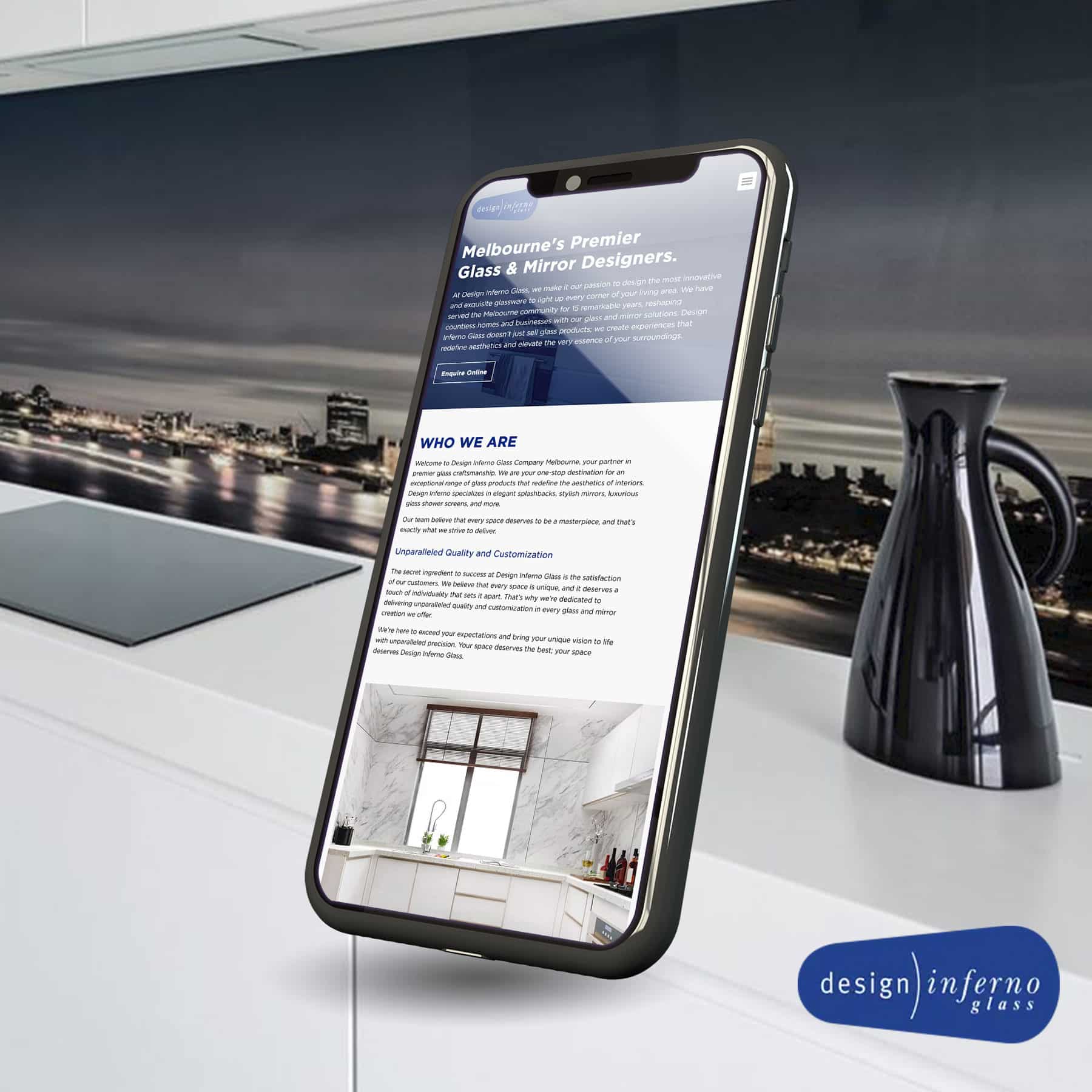
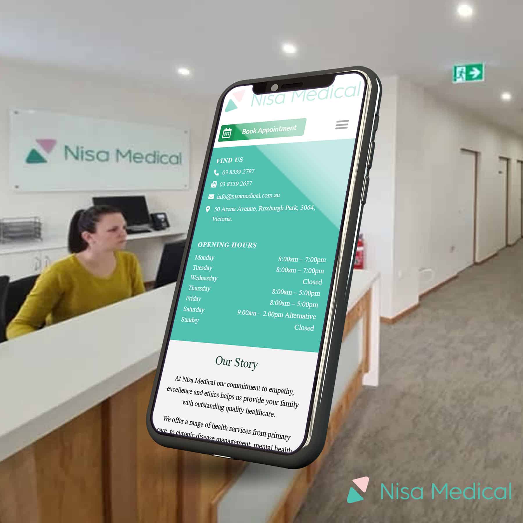
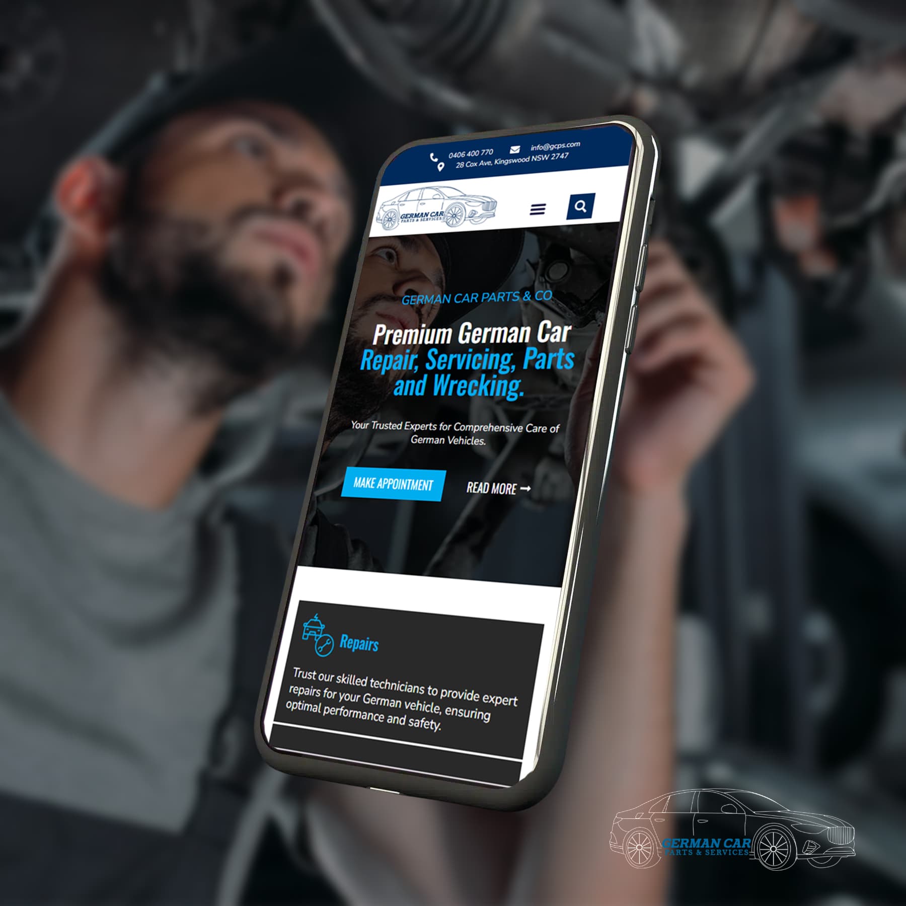
Enhanced User Experience and Engagement
A website optimised for mobile devices offers users a seamless and enjoyable experience. This leads to increased engagement, longer session durations, and higher conversion rates.

Improved Conversion Rates and Sales
Mobile commerce has exploded, and having a mobile-optimised website is crucial for capturing this market. Customers are more likely to purchase if they can easily navigate and interact with your site on their smartphones.

Higher Search Engine Rankings and Visibility
Search engines like Google prioritise mobile-friendly websites in their search results. By optimising your website for mobile, you increase your chances of ranking higher and attracting more organic traffic.

Building Trust and Credibility
A mobile-friendly website reflects a business's commitment to staying up-to-date with technology and providing a positive user experience. This builds trust and credibility with customers.


Conducting a Mobile-Friendliness Test
Use Google's Mobile-Friendly Test tools to assess your website's compatibility with mobile devices.

Using a Responsive Website Design Framework
Choose a responsive design framework or theme that automatically adapts to different screen sizes.

Accelerating Website Speed
Implement techniques like image optimisation, code minification, and browser caching to improve loading speed.

Simplifying Navigation and Content Structure
Create a straightforward and intuitive navigation menu for mobile users. Prioritise essential content and eliminate clutter.

Optimising Images for Mobile Devices
Compress images without sacrificing quality to reduce file size and improve loading times.

Implementing Mobile-Specific Features
Add click-to-call buttons, location-based services, or mobile-friendly forms.

Testing Across Different Devices and Screen Sizes
Thoroughly test your website on various devices and screen sizes to identify and fix any issues.