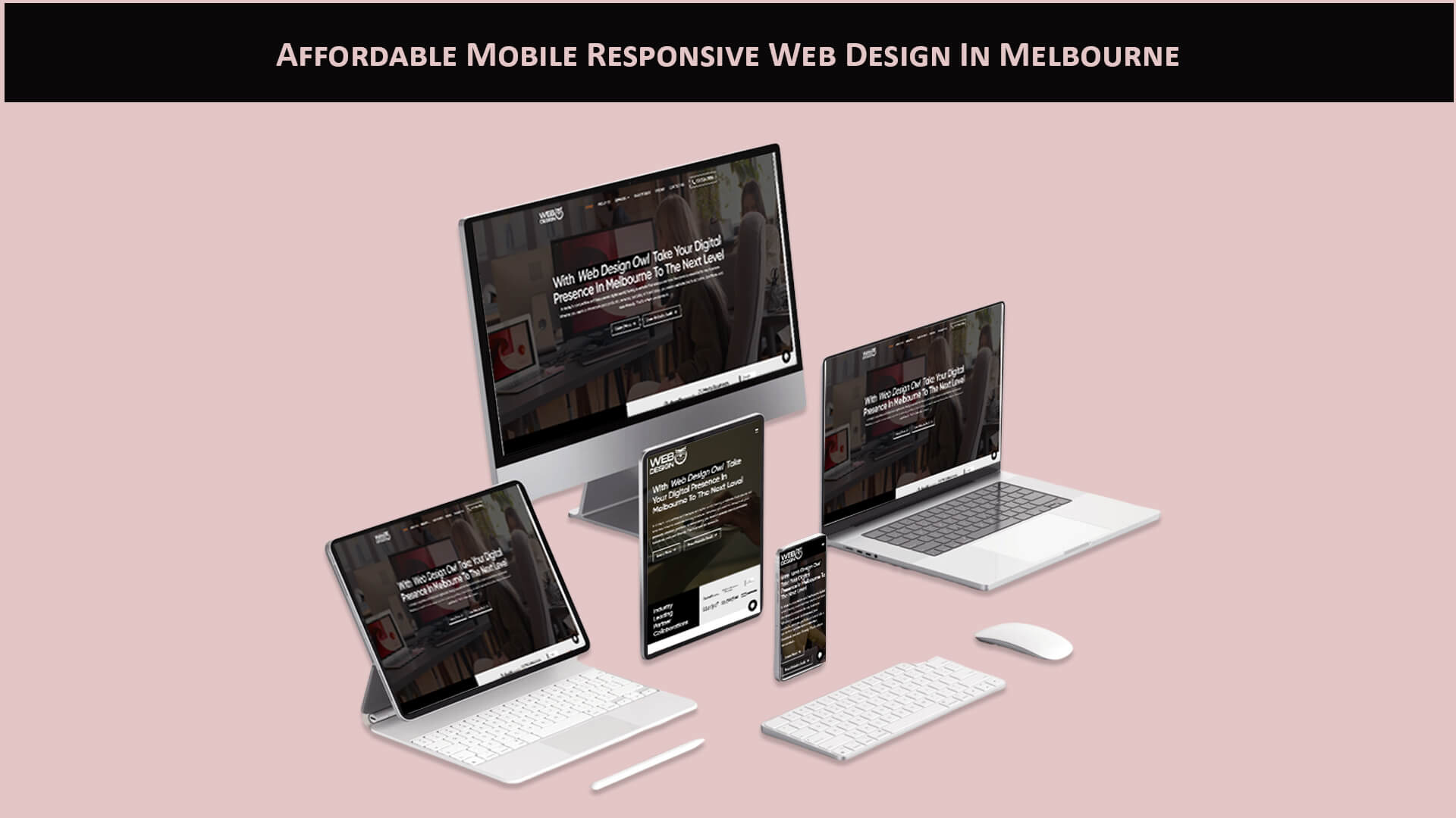
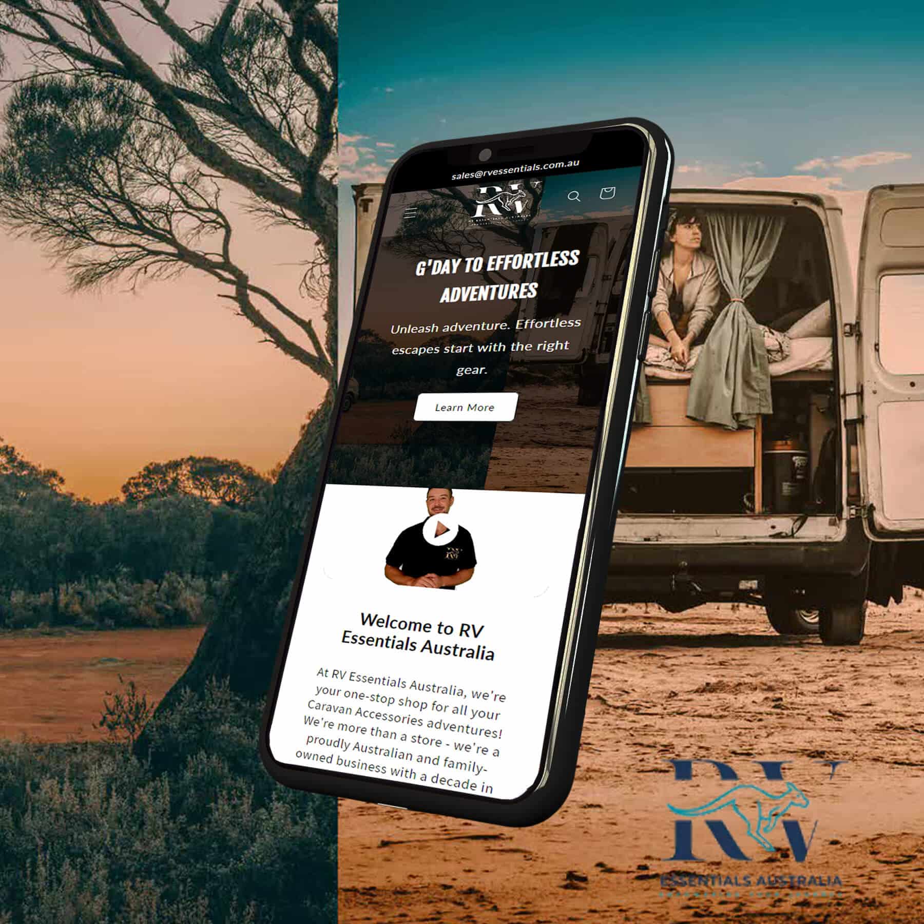
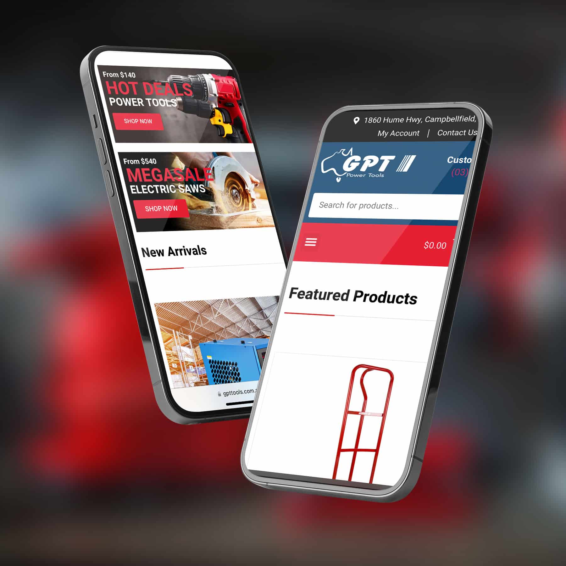
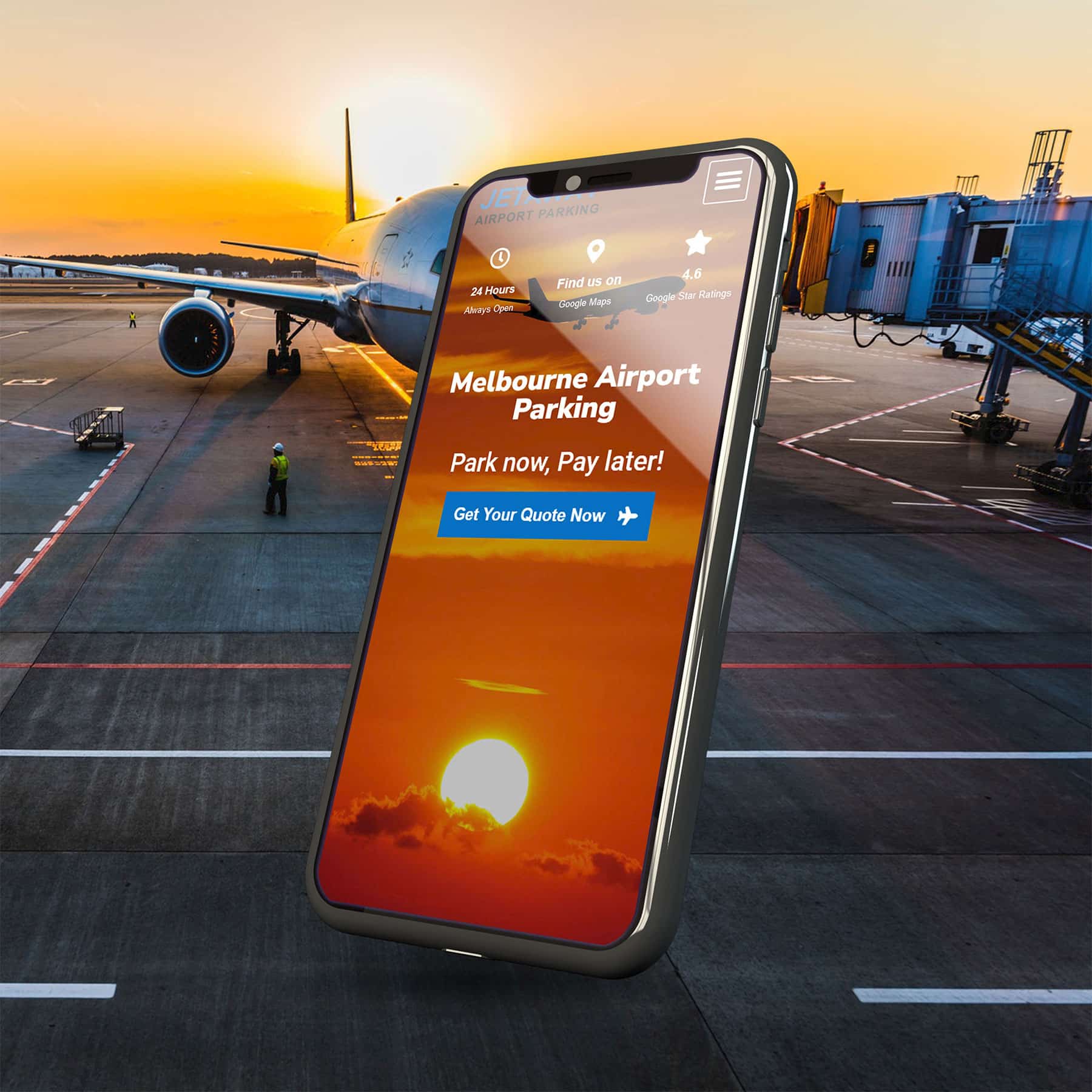
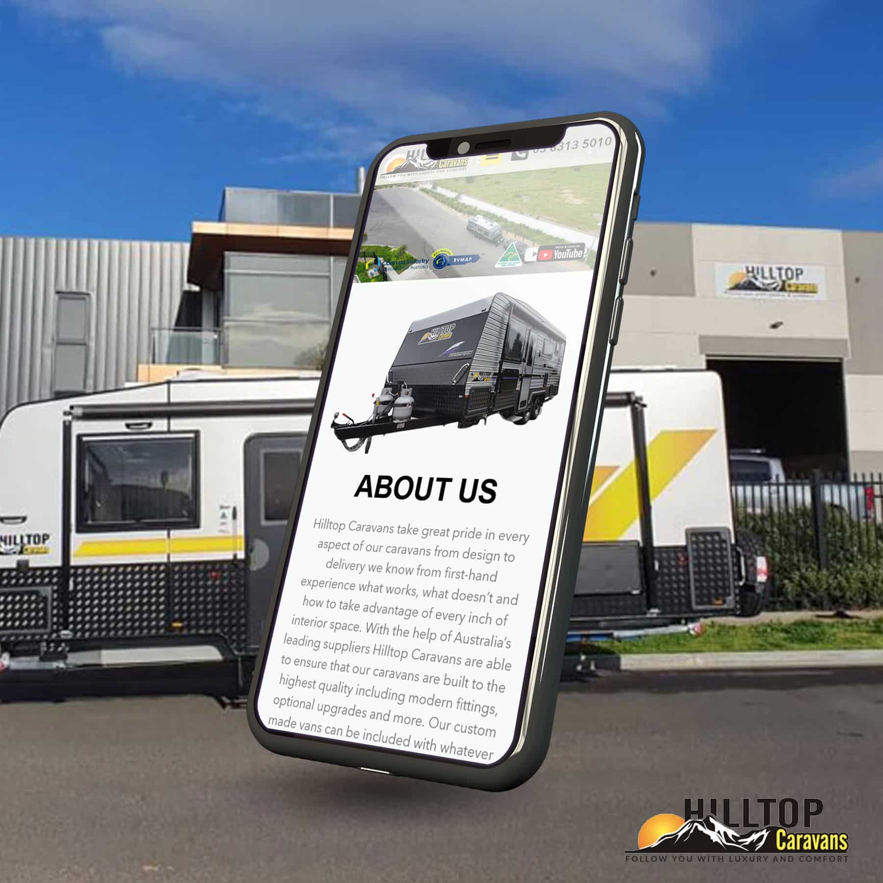
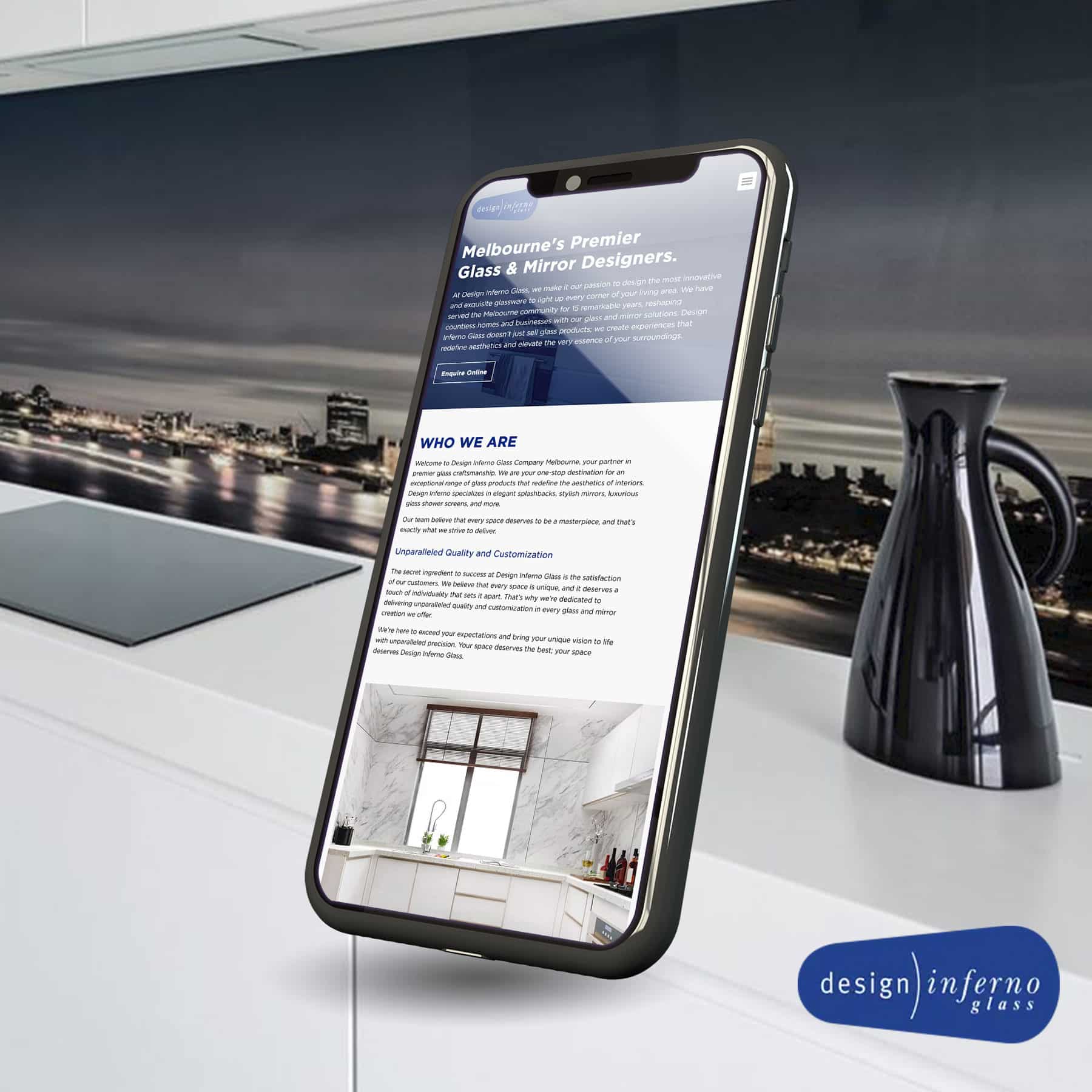
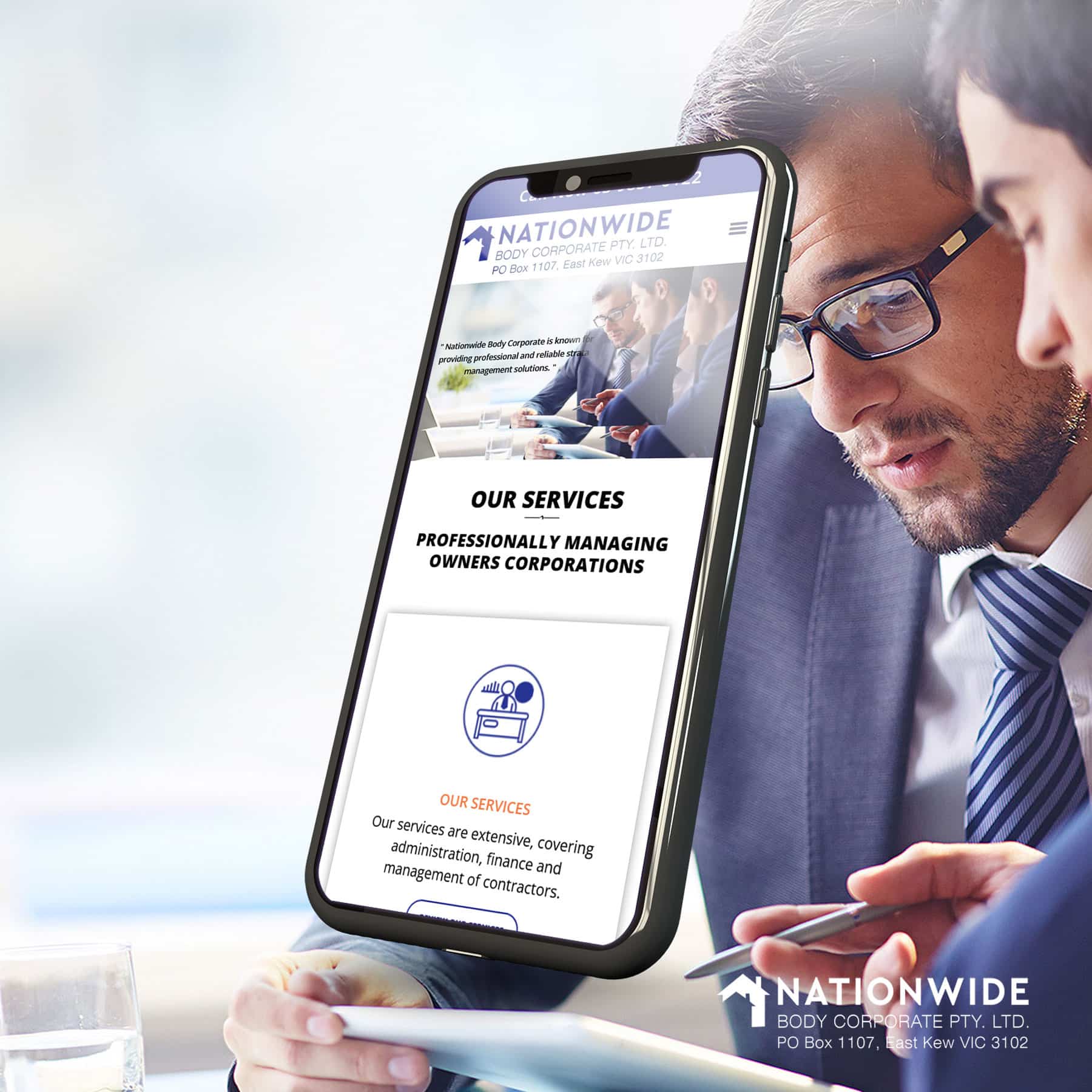
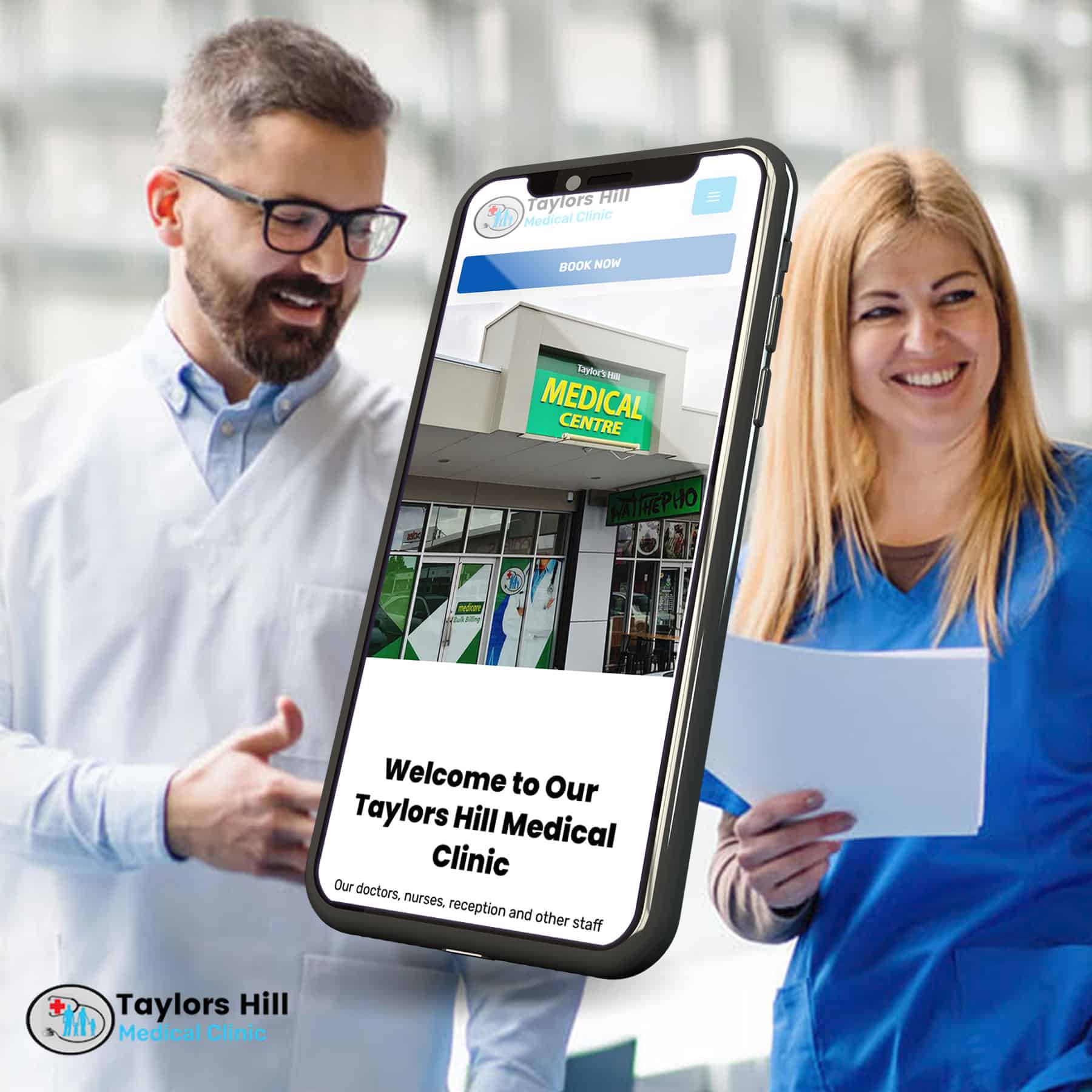
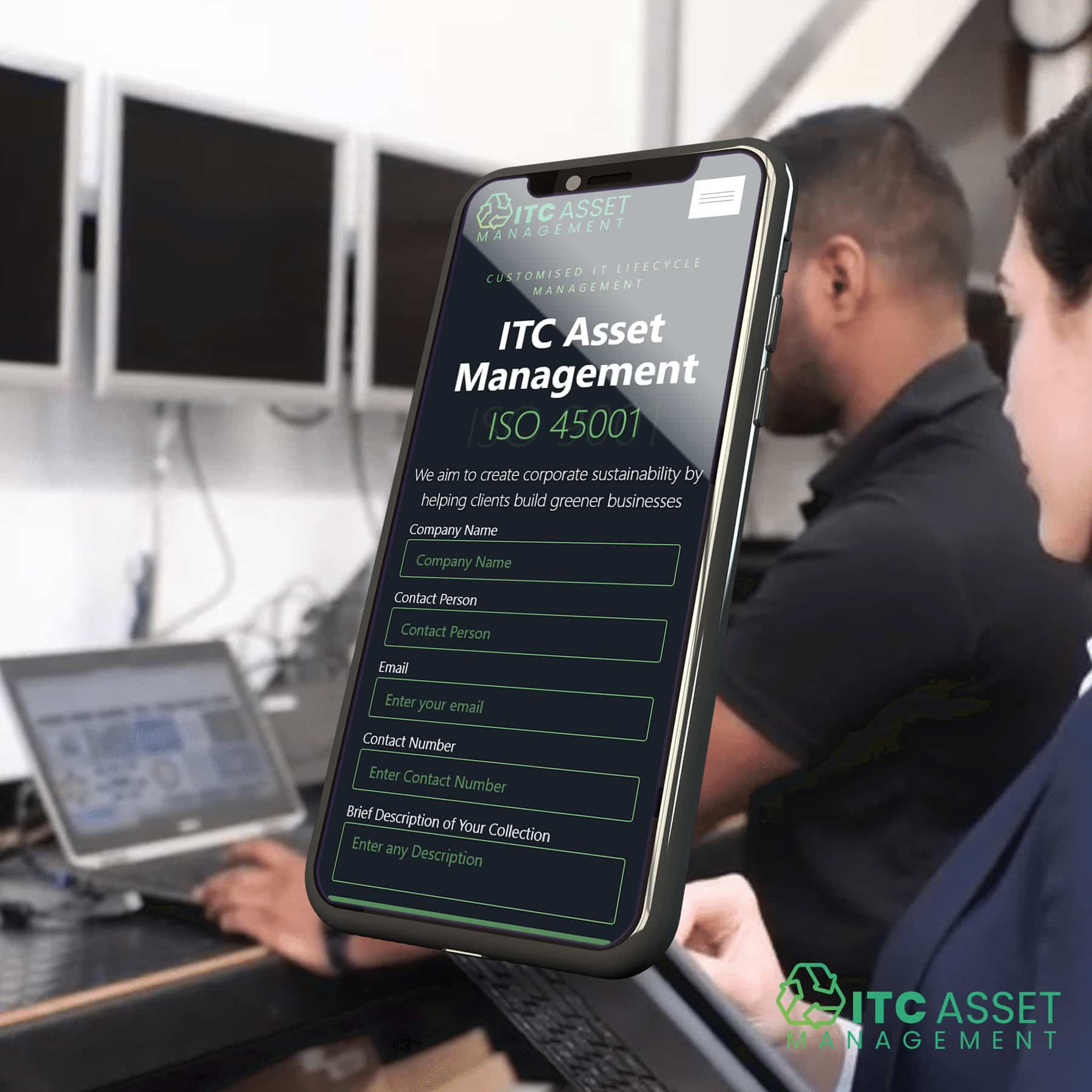
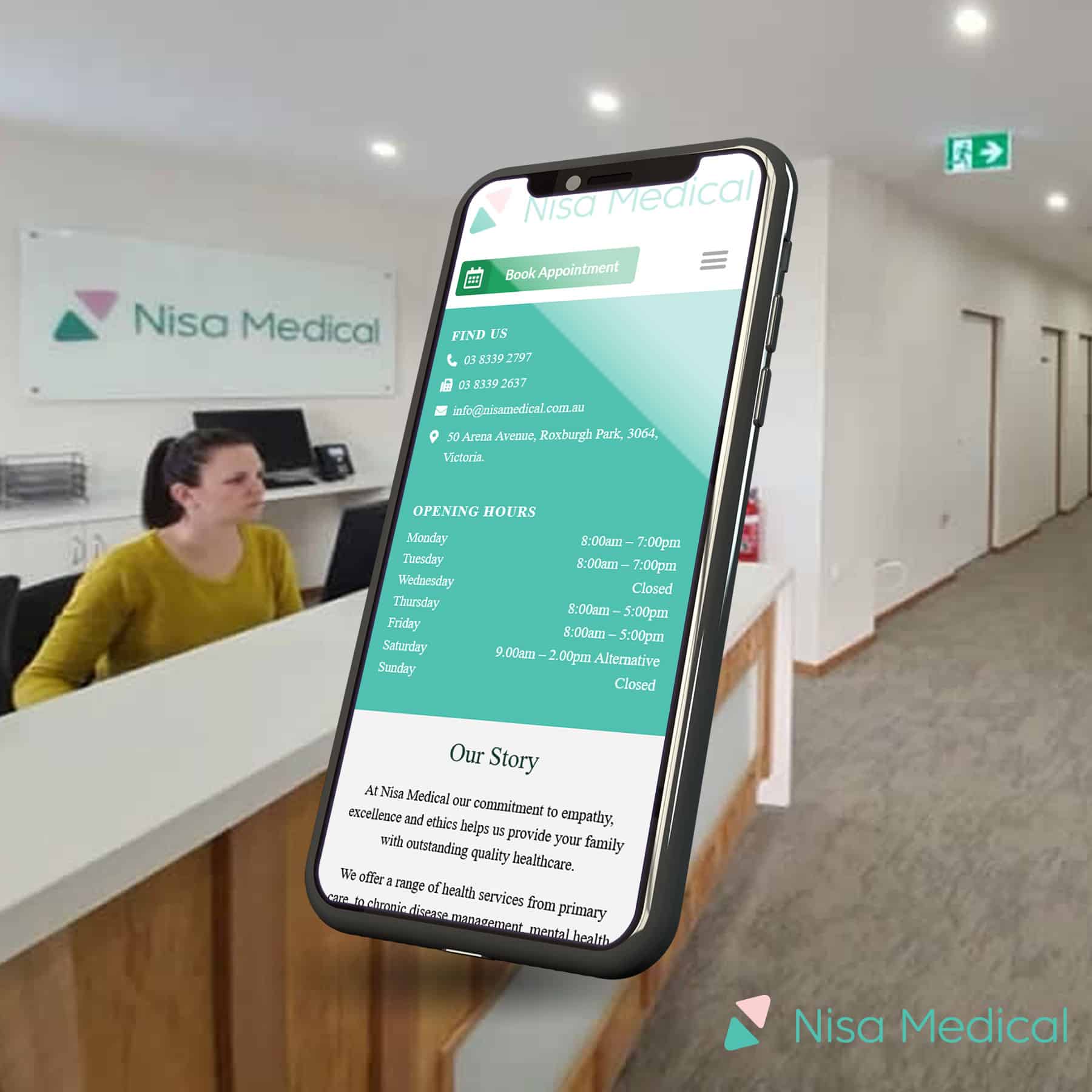
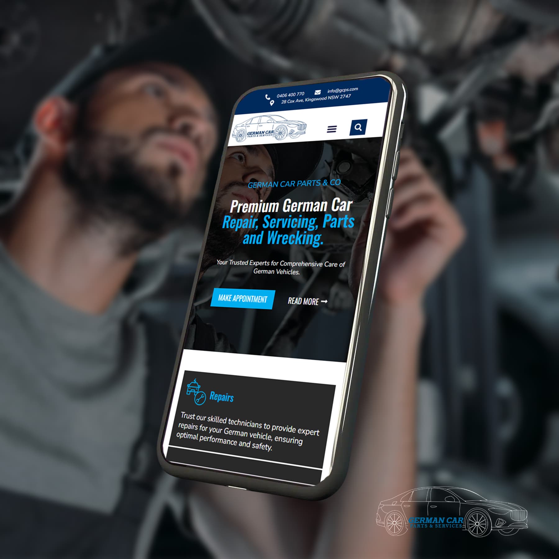
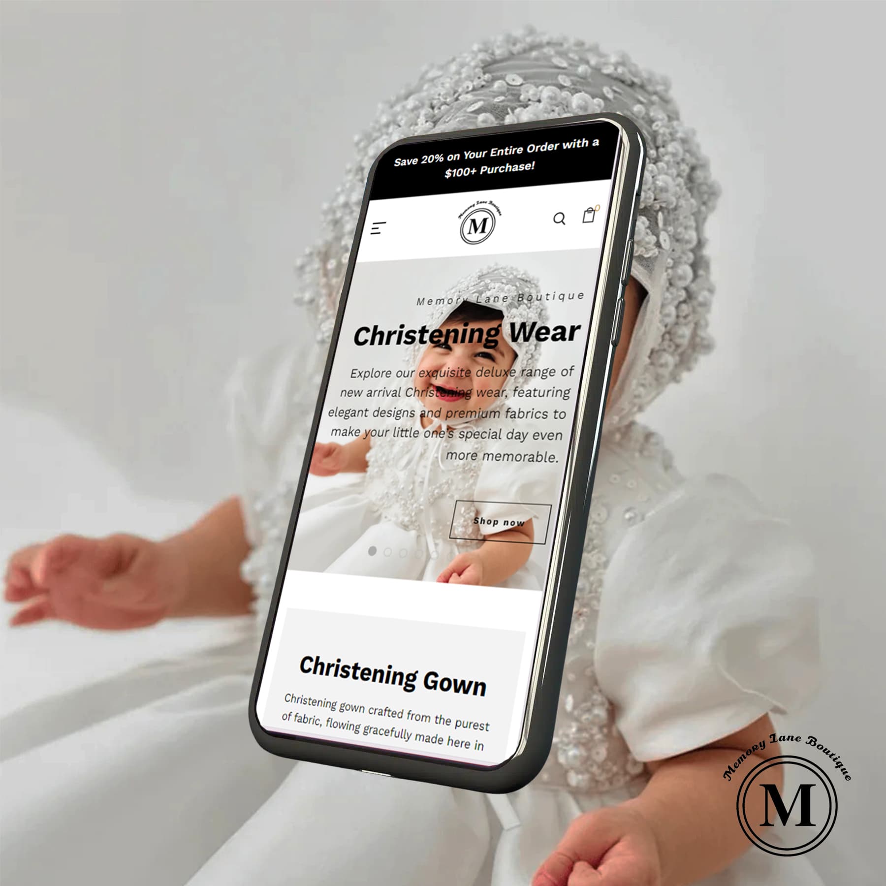
If you are designing a website for your business, make sure that it is a mobile responsive website in Melbourne. It should be visually appealing and function smoothly on mobile devices and tablets. This is important because many people use their phones for web browsing these days.
In this article, we will give a brief overview of why you need a mobile-friendly web design for your businesses in Melbourne.
What is a Mobile Responsive Website?
Before moving any further, you should have a clear idea about what a mobile responsive website is. Let’s break down its features so that they’re easy to identify.
- Easy to use on any device When you open a website on your phone, you might have noticed that some websites are hard to read or navigate. But, with a mobile responsive website, everything adjusts to your screen. So, the text, images, and menus become just the right size for your phone or tablet.
- Adjusts automatically: These websites are smart. They can tell what device you’re using and automatically adjust everything to fit your screen size and the way you hold your device. So, if you’re using your phone in portrait mode, the website arranges itself one way. If you switch to landscape mode, it rearranges to fit that too.
- Better experience for everyone: The main goal of a mobile, flexible website is to make sure that all visitors have a good time, no matter what devices they use. People are more likely to stay on the website and find what they need because it is simple to read, operate, and use.
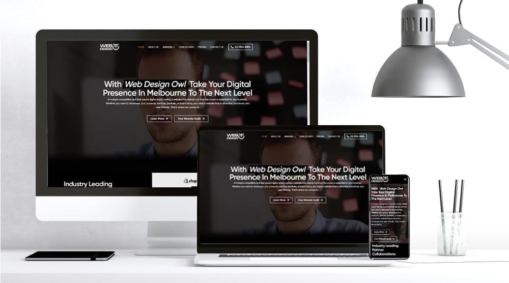
Why mobile responsiveness matters for Melbourne businesses
There are many good reasons to choose a mobile-responsive website for your business in Melbourne. Let’s look at each of these benefits one by one.
Everyone’s on mobile
Think about it. When you want to find something, you probably grab your phone and start searching. Everyone’s doing it! That’s why businesses need mobile responsive web designs in Melbourne. If your website is hard to use on a phone, people might just go to another site that’s easier to navigate.
Stand out from competition
In Melbourne's competitive market, having a mobile-friendly website can give your business an edge. It shows that you're keeping up with the trends and care about your customers' experience. When customers see that your site works smoothly on their phones, they'll choose you over others.
Smooth customer experience
Nowadays, people expect websites to be easy to use on their phones. They want to find information quickly, without zooming in and out or struggling with menus. A mobile-responsive website meets these expectations, making sure customers have a smooth experience every time.
Quick to load
These websites are designed to load fast. This is important for mobile users who might have slower internet connections. This is done by making images smaller in size and using special features designed for mobiles.
The key features of a mobile responsive web design
Your website’s mobile responsive design is like a magic trick. It ensures your website appears great on all devices, from desktops to phones. Here is how it works:
Adaptable layouts
he design changes to fit the screen size and the way you hold your device, like a phone, tablet, or computer. This makes sure you can always read and use the content easily.
Images that work on any device
Images adjust their size and quality depending on your device. They look great on big, fancy screens and don’t make websites slow to load on smaller ones.
Text you can read easily
The size and spacing of the text are set up for smaller screens. This means you don’t have to zoom in to read comfortably, so it is a better experience.
Navigation made simple
Menus and buttons are designed for touchscreen use, so they’re easy to tap. Dropdown menus are often made simpler, and buttons might be bigger, all to help you navigate more easily.
Quick to load
These websites are designed to load fast. This is important for mobile users who might have slower internet connections. This is done by making images smaller in size and using special features designed for mobiles.
Mobile vs desktop: Tailoring user experience in Melbourne
The way that people use their phones and computers for web browsing is quite different. Let’s find out about these changes and what they mean for websites.
- Mobile vs. desktop usage: Think about how you use your phone compared to your computer. On your phone, you’re likely on the go, checking things quickly, maybe while grabbing a coffee or in a vehicle. If you are using a desktop, you’re probably more settled, like at home or work.
- Design for easy mobile use: On your phone, you use your thumbs a lot to click and scroll, right? Websites should be made with this in mind. Big buttons, easy menus, and quick-to-load pages are key for phone users. This makes it easier for you to find what you need without any trouble.
- Content for quick browsing: When you’re on your phone, you’re probably not in the mood for long reads. That’s why websites should have short, snappy info on mobiles. But on desktops, more detailed content is great, where people might dive deeper.
Let's Find Out Our Success Stories & Social Buzz
The SEO benefits of a mobile responsive website in Melbourne
Having a mobile-friendly website is not just good for your visitors; it’s also great for your website’s ranking on search engines like Google. Here’s why.
- Search engines love mobile-friendly sites: They prioritise mobile-friendly websites when ranking the websites in search results. Google will rank your site better if it’s mobile-friendly, easy to navigate, and speedy. This is important because higher rankings mean more visitors to your business’s website.
- Keeps visitors happy: Imagine going to a website on your phone and finding it hard to use. You’d probably leave quickly, right? Search engines keep track of how long people stay on your website. If it’s mobile-friendly, people are likely to stick around longer. This tells search engines that your site is helpful and could lead to better rankings in search results.
- Better for local searches in Melbourne: A lot of people in Melbourne use their phones to search for local businesses. If you have a mobile responsive website in Melbourne, it’s more likely to show up in these local searches. This means people nearby can find your business easily when they’re searching for something you offer.

Affordable mobile responsive web design in Melbourne
You don’t need a huge budget to go mobile-friendly. There are plenty of cost-effective solutions out there. For example, you can use website builders that offer responsive design templates. These are often less expensive than custom designs but still look great and work well on mobiles.
However, you should spend time and have better experience designing a website using a website builder. That’s where custom web designing services come into play. Most people think that these services are expensive. Well, they are a bit more expensive than website builders, but you can think of it as a smart long-term investment.
Spending a bit on a mobile-friendly website is a smart investment. Why? Because it can help you attract more customers and keep them coming back. In the long run, the extra business can more than make up for what you spend upfront.
There are a bunch of talented web designers and agencies right here in Melbourne who specialise in responsive website design. They understand the local market and can offer personalised service. Also, by going local, you support the Melbourne business community, which is always a great thing!
Final thoughts
Having a mobile responsive website in Melbourne is like making your business ready for the future. In a busy city like Melbourne, people use phones to do everything. You can use this to your advantage and stand out from the competition. That’s where a mobile-friendly website becomes handy.
Now it is high time to make your website mobile-friendly if it isn’t already. It’s okay if you don’t know where to begin. Melbourne has a lot of professionals who can help you. Taking that first step is what matters.
So, take that first step today by reaching out to our expert team at Web Design Owl by PMGS. We are a professional web designing company in Melbourne. We have helped hundreds of businesses over the years to own a responsive mobile website in Melbourne. Contact us to get your quotation.
Powerful Tools We Use to Build Exceptional websites
Powerful Tools We Use to Build Exceptional websites

