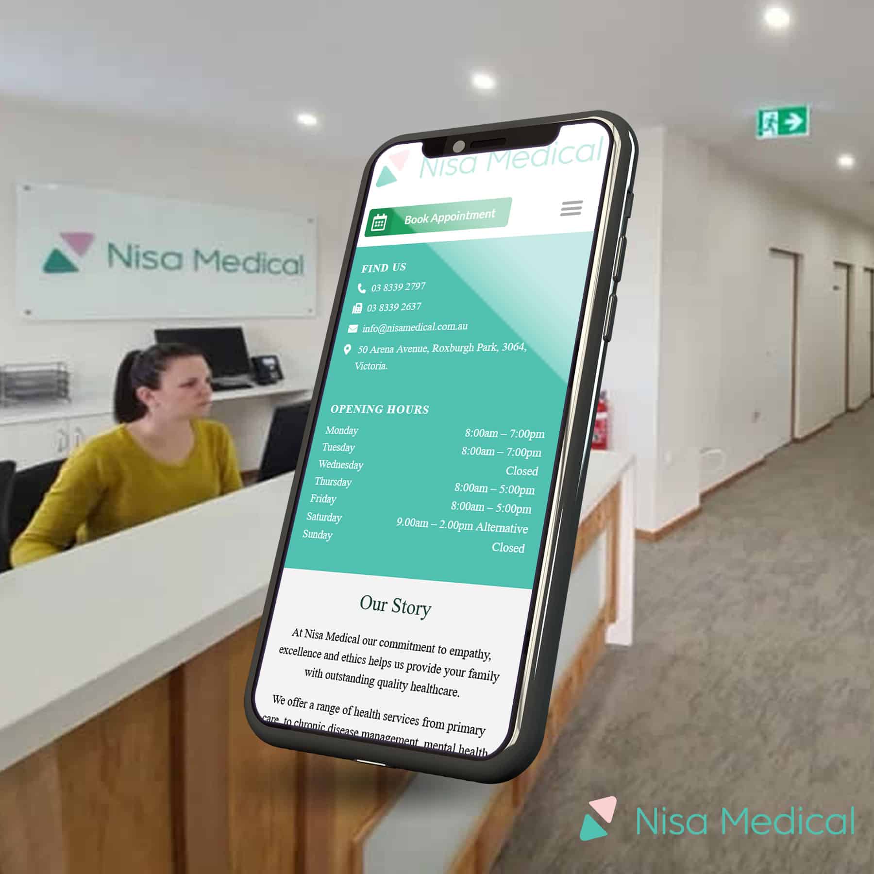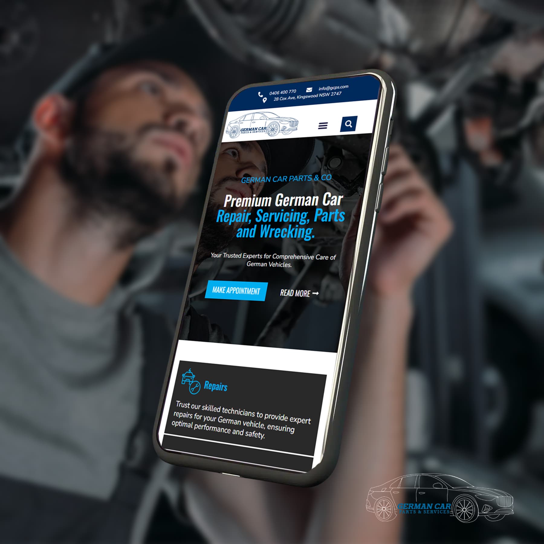


Improved User Experience
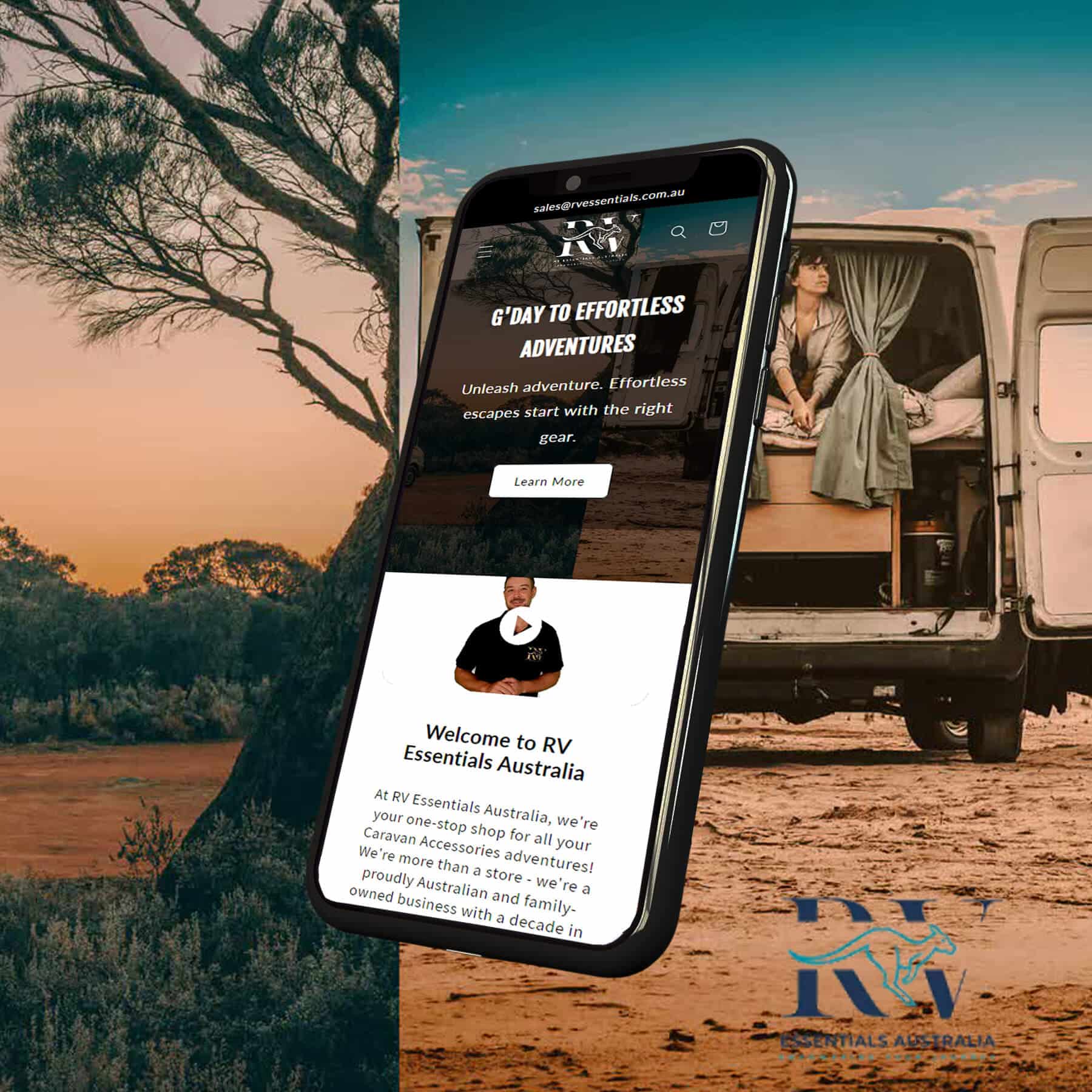
First impressions matter; users will notice if your website isn’t responsive. They're likely to leave if they have to pinch and zoom to read text or if images are poorly aligned. A well-designed, responsive site keeps visitors engaged and makes it easy to find what they need.
In Australia, 57% of users say they won’t recommend a business with a poorly designed mobile site. This shows that user experience is crucial for customer satisfaction and brand loyalty. Responsive web design enhances usability, making your site intuitive and enjoyable to browse, no matter the device.

Boosts SEO Rankings
Google prioritises mobile-friendly websites in its search rankings. If your website isn't responsive, you'll likely miss out on higher search engine rankings, which could hurt your visibility.
With more Australians relying on mobile devices for internet access, a responsive site improves your chances of ranking well and increases your likelihood of being discovered by new customers. Implementing responsive design is critical to optimising your site for SEO in 2024 and beyond.

Increased Conversion Rates
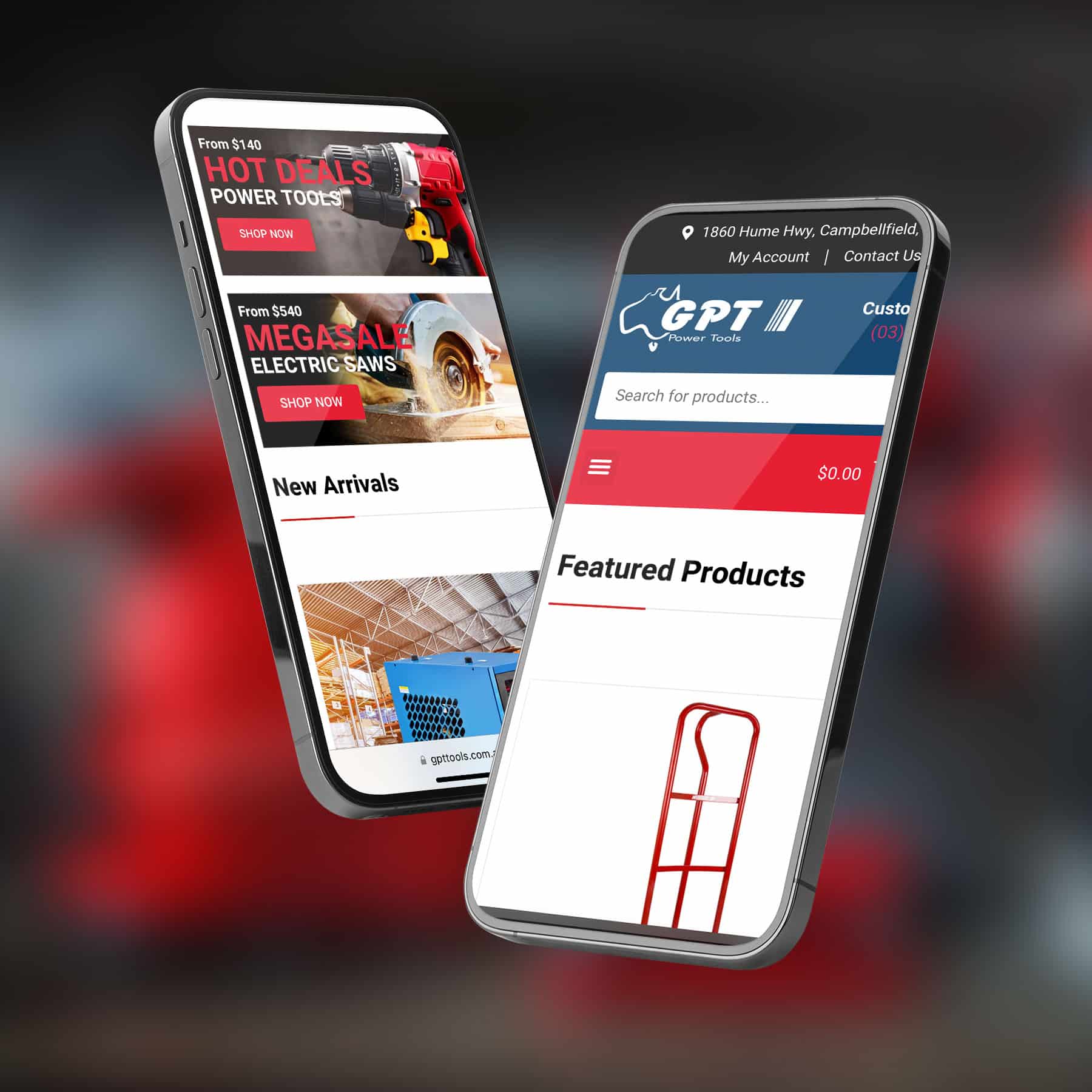
Your website is often the first point of contact between you and potential customers. A non-responsive website can frustrate visitors, who quickly exit without making a purchase or inquiry. On the other hand, a responsive site provides a smooth journey from browsing to checkout, which can lead to higher conversion rates.
This is especially important for Australian businesses as mobile commerce continues to rise. Ensuring your site is easy to navigate and functions seamlessly on all devices can significantly impact your bottom line.

Cost-Effective and Easier Maintenance
Maintaining separate websites for desktop and mobile users takes time and effort. A responsive website simplifies this process by ensuring one design adapts to all devices. This reduces the need for constant updates or adjustments for different platforms, saving your business time and money.

Catering to Australia’s Diverse Internet Habits
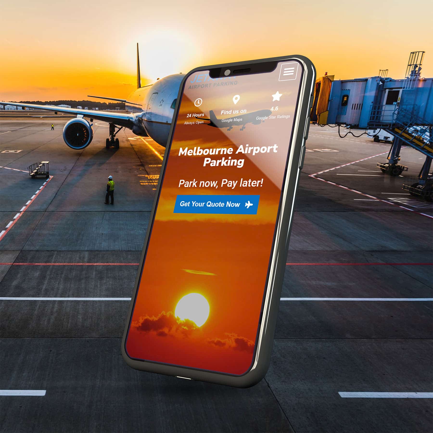
Australia has a diverse population with varying internet habits. From bustling cities like Sydney and Melbourne to rural regions, the way people access information can vary greatly. Whether using a high-speed connection to the town or mobile data in more remote areas, a responsive website ensures fast loading times and a smooth experience.
Australians expect websites to load quickly. Research shows that 47% of users expect a web page to load within two seconds. A responsive site that is optimised for speed keeps users on your page longer, reducing bounce rates and increasing engagement