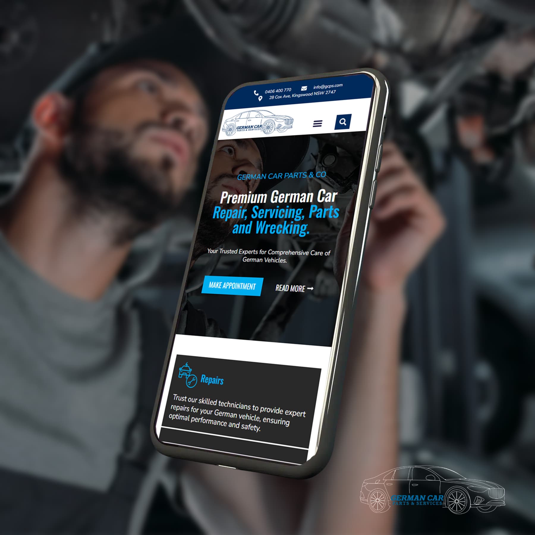
In an era where your digital storefront can often define first impressions and drive business, web design is more critical than it has ever been. Today, we’ll talk about the common missteps businesses often make when designing their websites and how to avoid them. By steering clear of these pitfalls, you can create a web presence that not only captures the attention of your audience but also achieves your business goals.
Poor Navigation
One of the most frequent complaints from users is being unable to find what they’re looking for on a website. Confusing navigation can lead to high bounce rates and low engagement. Here are some tips on how to fix it:
Simplify Your Menu
Use descriptive labels and avoid jargon that might confuse new visitors. Keep the number of items in your main navigation to a minimum - aim for seven items or less.
Incorporate a Search Bar
Sometimes, users know exactly what they want. A good search function can make their job easier, allowing them to skip navigation altogether.
Implement Breadcrumbs
This tool isn’t just for Hansel and Gretel. It’s a trail of where users have been on your site, helping them orient themselves and understand the structure of your content as they go.

Overloading with Text
Use Headings and Subheadings
These can give a quick overview of the content and allow readers to decide if they want to read further.
Bullet Points and Lists
When appropriate, lists can break up content in an easily digestible format.
Visuals Speak Louder
Images, infographics, and videos provide alternative ways to convey information that can complement or sometimes even replace text.
Ignoring Mobile Optimisation
With mobile internet usage surpassing desktop, if you’re not thinking mobile-first, you’re behind the curve. Keep these tips in mind to stay relevant:

Adopt Responsive Design
Your website should be able to fluidly change its layout depending on the screen size, ensuring a consistent and optimal experience for users.
Optimise for Touch
Buttons and links should be large enough to tap with a finger, and there should be enough space between clickable elements to avoid accidental clicks.
Simplify the Design
On smaller screens, it’s important to prioritise the most critical content and features, stripping away any unnecessary elements.

Slow Load Times
Image Optimisation
Compress images without sacrificing quality and use the appropriate file formats (e.g., use JPEGs for photographs).
Minimise HTTP Requests
Reduce the number of elements on your webpage, such as scripts and style sheets.
Browser Caching
This allows you to store commonly used files like images and scripts on your visitor’s device, reducing the need to download them each time they visit your site.
Using Inconsistent or Poor Quality Images
Images are a potent tool in web design, but their power can be disruptive if misused. Keep it consistent and high-quality:

Choose Relevant Images
Every image on your website should serve a purpose and be directly related to your content or message.
Maintain a Style
Think about your overall brand and the message you want to convey. Keeping your imagery in a consistent style can help reinforce your brand identity.
Buyer Beware of Stock Photos
Stock photos can be great, but choose carefully to avoid cliché or overused images that may make your site seem unoriginal.
Complicated Forms
Forms such as sign-ups and checkouts are vital for many websites’ conversion funnels. Here are some tricks to get your users through these potential barriers:

Minimal Fields
Only ask for essential information. The more fields you have, the more likely users will drop off.
Clear Labels and Instructions
Make it absolutely clear what type of information you’re asking for and why you need it. Ambiguity can be a real conversion killer.
Progressive Disclosure
If you can, avoid scaring off users with a sea of blank form fields. Instead, reveal fields only as they become relevant.
Let's Find Out Our Success Stories & Social Buzz
Lack of Clear Calls to Action (CTAs)
Action-Oriented Wording
Use actionable language that leaves no doubt about what will happen when the CTA is clicked.
Contrasting Colors
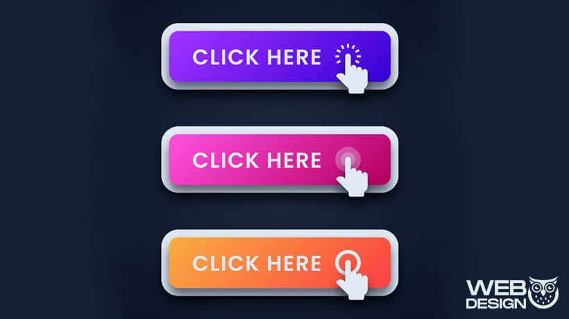
Your CTA should stand out. Make sure it’s highly visible with a colour that contrasts against its background.
A/B Test CTAs
Different audiences respond to different things. Regularly test and tweak your CTAs to maximise their effectiveness.
Ignoring SEO Best Practices
Aesthetic appeal is important, but so is being found. Search Engine Optimisation (SEO) is critical to any website’s success. Here are some to consider:

Keyword Research and Usage
Know what your audience is searching for and ensure that those keywords are present in your titles, headings, and body.
Site Structure
Clear website architecture not only helps users find their way around but also makes it easier for search engines to crawl and index your site.
Mobile Optimisation
With Google using mobile-first indexing, your site’s mobile experience directly impacts your SEO performance
By making these adjustments, you can elevate your web design and create a more user-friendly and effective site that reflects positively on your business. Remember, web design is a process of continuous improvement. Regular audits and user testing can help you identify areas for enhancement and keep you ahead in the digital market.
frequently asked questions
How do I optimise images for my website?
Optimising images for your website is crucial to ensure it loads quickly and performs well. Here are the basic steps you should follow:
- Resize your images: Ensure your photos are not larger than necessary. Use image editing tools to resize them without losing quality.
- Choose the correct format: JPEG is best for photographs, while PNGs are better for graphics with fewer colours. WebP provides superior compression and quality.
- Compress the images: Use online tools or software to compress the images. They reduce the file size by removing unnecessary data.
- Use responsive images: Implement HTML code that allows different images to load on various devices based on screen size.
- Lazy loading: If your page contains many images, consider using lazy loading, which only loads images when they are about to enter the viewport.
- Optimise Alt tags: Include relevant keywords for SEO and accessibility.
What role would forms play on a website?
Forms serve as a critical communication bridge between a website and its visitors. They are essential for gathering necessary information, facilitating transactions and interactions, and tailoring the user experience. Forms can range from simple contact forms that allow users to ask questions or request information to complex orders or booking forms that handle transactions. By providing an easy way for customers to engage, forms help businesses generate leads, receive feedback, streamline their services, and enhance user satisfaction.
Why are Clear Calls to Action (CTAs) essential on websites?
Clear Calls to Action on your website serve as the guiding lights for your visitors, showing them what steps to take next—whether it’s making a purchase, signing up for a newsletter, or downloading a whitepaper. Without CTAs, users may feel lost and leave without engaging further, significantly affecting conversion rates. Effective CTAs are concise, action-oriented, and visually prominent, making it easier for users to make decisions and interact with your site how you intend them to.
What tools can I use to measure my website's load time?
Several tools can help you analyse and measure your website’s loading time. You can use services like Google PageSpeed Insights, GTmetrix, Pingdom, and WebPageTest. These tools measure your site’s performance and provide insights and suggestions for improvement.
Why is mobile optimisation important on websites?
Given the growth in smartphone and tablet use, mobile optimisation has become critical in web design. It ensures websites are easily accessible and navigable on smaller screens, providing a seamless user experience. An optimised mobile site also aids in faster loading times, reduced bounce rates, and increased engagement and conversion. With mobile searches often surpassing desktop, being mobile-friendly boosts your website’s visibility in search engine rankings, making it fundamental for online success.
How should I effectively implement headings and subheadings on my webpage?
Headings and subheadings are vital navigational tools that guide visitors through your content, making it more digestible. To use them effectively:
- Structure content hierarchy: Use `<h1>` for the main page title and subsequent headings (`<h2>`, `<h3>`, etc.) to delineate sections and subsections appropriately.
- Be descriptive: Represent the section content to capture interest and help search engines understand your webpage better.
- Maintain consistency: Stick to a style and format for your headings and subheadings to create a cohesive experience.
- Incorporate keywords: When possible and natural, include relevant keywords to improve SEO.
- Keep it short and sweet: Aim for concise, engaging headings that encouraging reading.
Using headings and subheadings correctly improves the user experience and can positively affect your site’s SEO performance.


