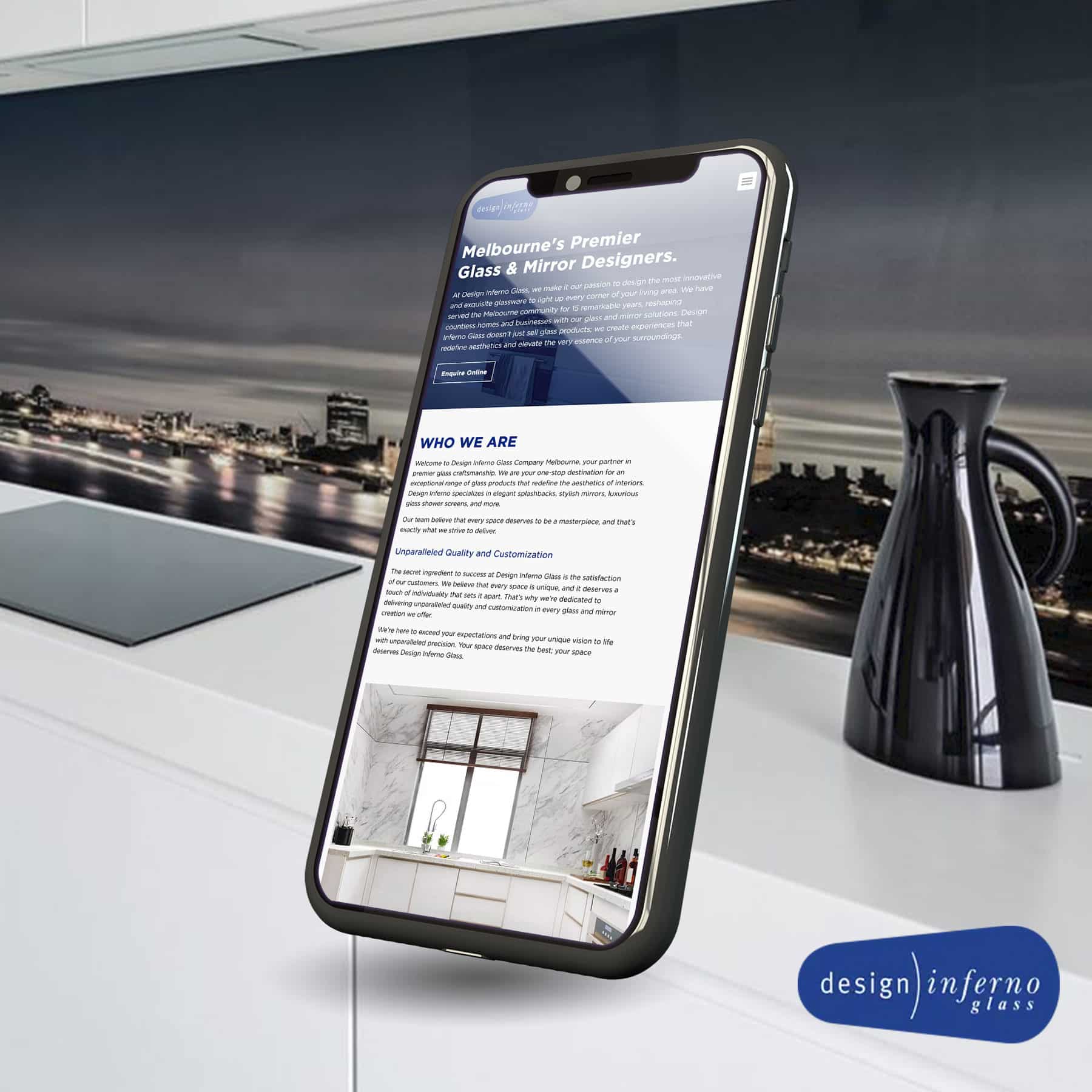
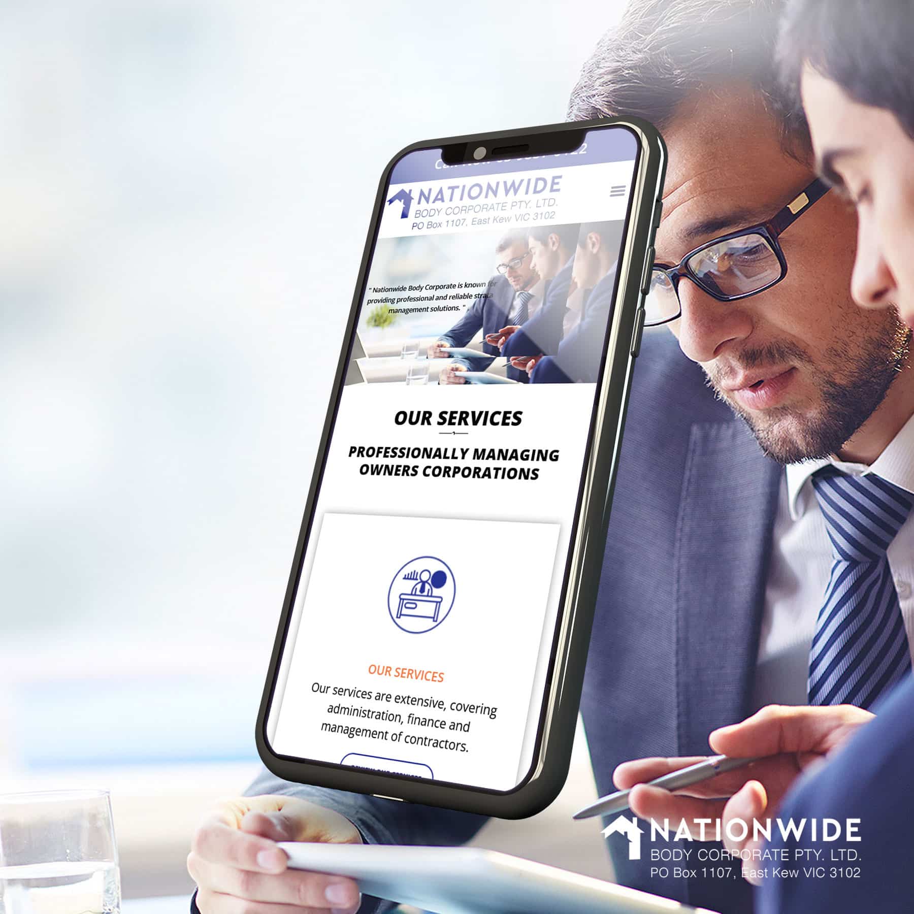
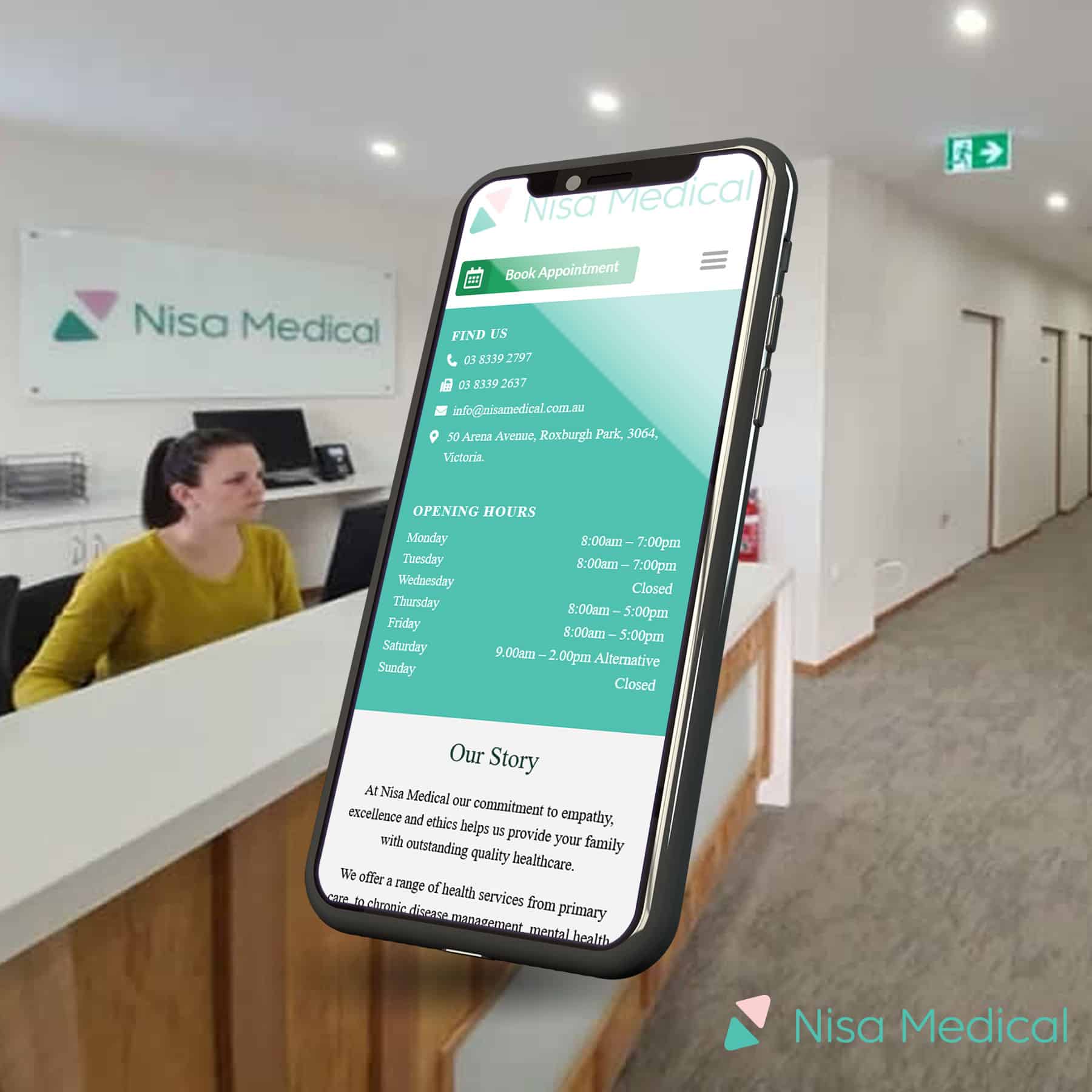
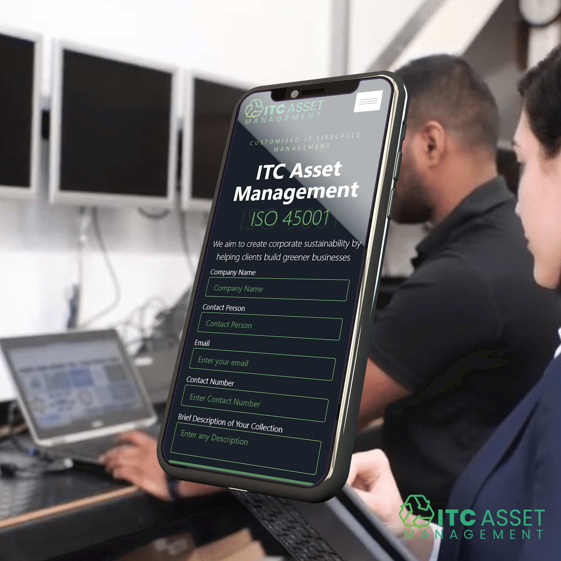
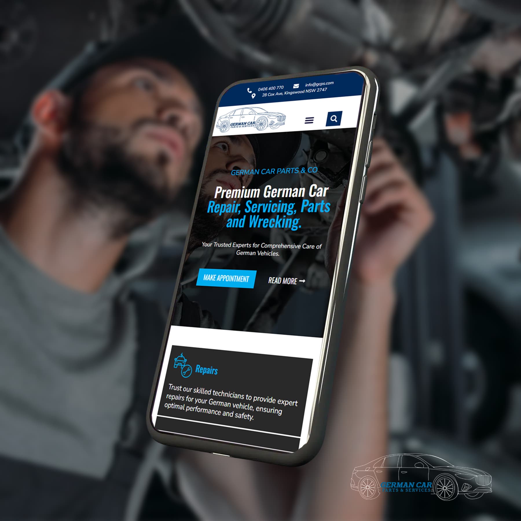
Ensuring your WordPress website works seamlessly across all devices is essential in today’s digital landscape. Responsive design enables your site to adapt effortlessly to various screen sizes, enhancing user experience, boosting SEO, and increasing engagement. This guide covers the top practices and tools to make your WordPress website look great on any device.
Why Responsive Design Matters
Responsive design automatically adjusts your site’s layout to fit different screens, improving the experience for mobile and desktop users alike. It’s also critical for search engine optimisation, as Google’s mobile-first indexing prioritises responsive sites.

Choosing a Responsive WordPress Theme
The simplest way to ensure responsiveness is by choosing the right theme. Here are some of the best options:
- Astra: Lightweight, fast, and optimised for all devices.
- OceanWP: Versatile and packed with mobile-friendly features.
- Neve: Designed with a mobile-first approach.
Always preview themes in the WordPress Customiser to check how they perform across different devices.
Optimising Images for Mobile Devices
Images are key to visual appeal but can slow down your site if not optimised. Here’s how to manage them effectively:
Use SVG images for scalable, high-quality visuals.
Install WP Smush or Imagify plugins to compress and optimise images.
Enable lazy loading to improve loading times on mobile.

Top Plugins for a Responsive WordPress Site
Several plugins can enhance your website’s responsiveness:
- Elementor: A page builder with mobile editing tools to create responsive layouts.
- WP Touch: Converts your site into a mobile-friendly version automatically.
- Jetpack: Offers a range of features, including mobile-optimised layouts and faster loading times.
Using CSS and Media Queries
For more control over your design, CSS and media queries allow you to fine-tune how your site appears on different screens. For example:
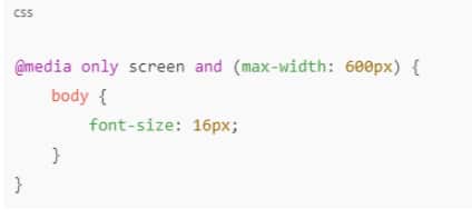
This ensures fonts and other elements adjust smoothly on smaller screens.

Testing Your Website’s Responsiveness
Testing how your website behaves on various devices before launch is essential. Use tools like:
- Google Mobile-Friendly Test
- Browser Developer Tools (Chrome, Firefox)
- Responsinator
These tools help simulate different screen sizes, ensuring your site performs well everywhere.
Best Practices for Mobile Responsiveness
- Simplify navigation: Use mobile-friendly menus and large, clickable buttons.
- Optimise for speed: Compress images, enable browser caching, and use CDNs for faster load times.
- Minimise pop-ups: Avoid intrusive pop-ups that can frustrate mobile users.
Let's Find Out Our Success Stories & Social Buzz
Conclusion
Making your WordPress website responsive is crucial for delivering a smooth and engaging user experience across all devices. Your site can shine on any screen by selecting a responsive theme, optimising images, using the right plugins, and testing regularly. For expert help in building or optimising your website, consider partnering with Web Design Owl, a trusted specialist in responsive WordPress web design. With their expertise, your site will look great and perform flawlessly, ensuring an outstanding experience for all visitors.


