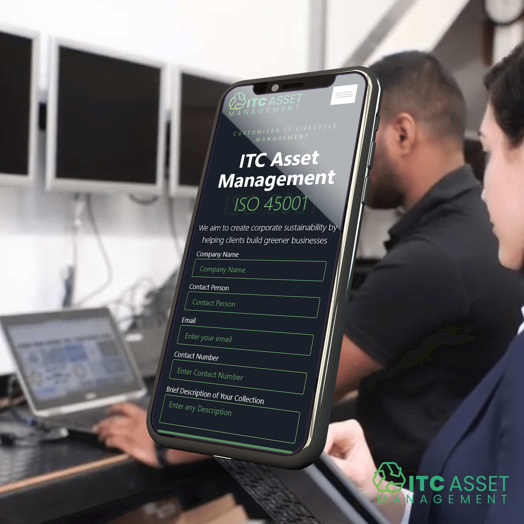
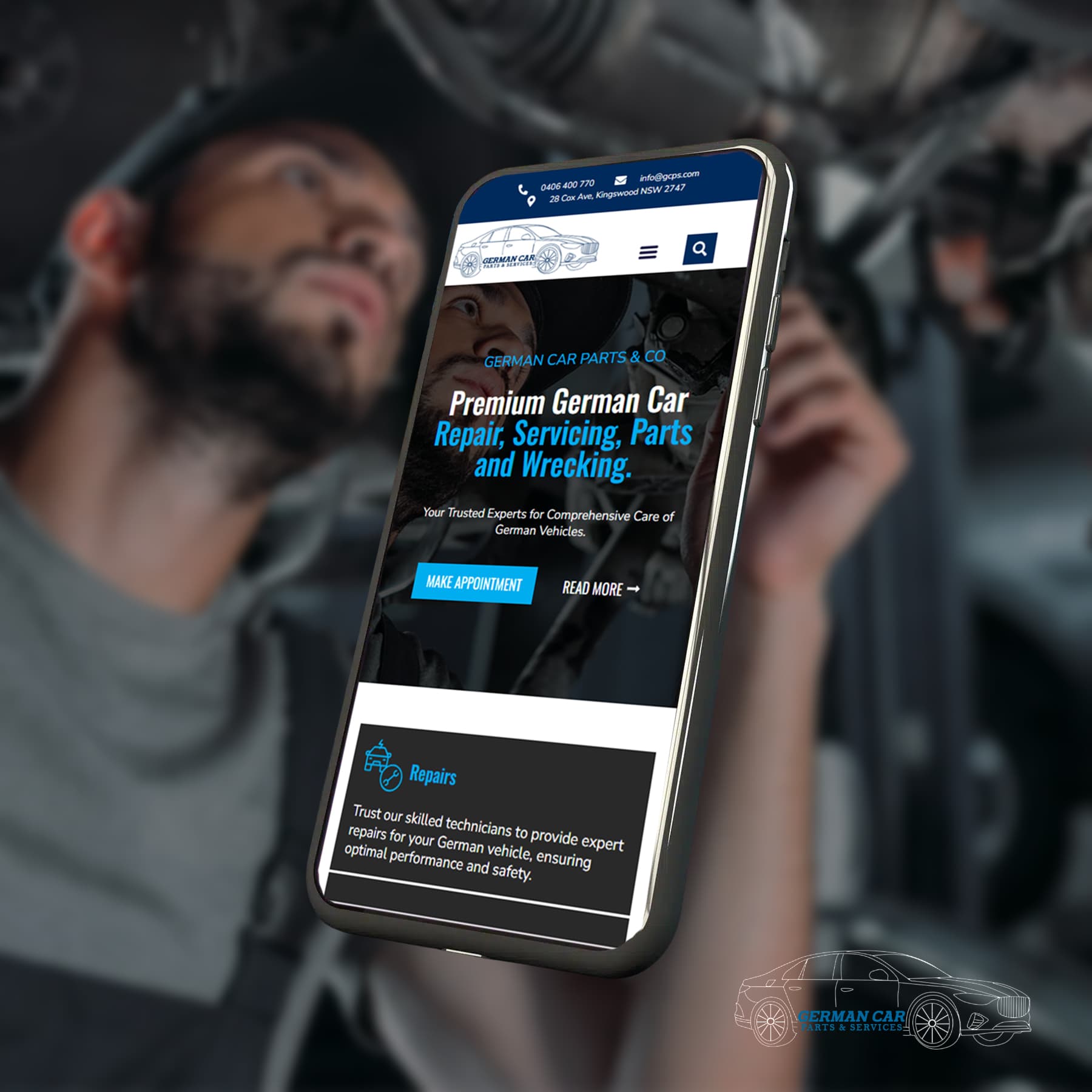
In the fast-paced digital world of today, having a responsive website is no longer a luxury—it’s a necessity. For Melbourne businesses, the benefits of responsive web design extend beyond just aesthetics; they include increased mobile traffic, enhanced user experience, and improved SEO rankings. WordPress, a leading platform for website development, offers a wealth of options to create responsive websites that cater to diverse user needs.
Understanding Responsive Design Principles
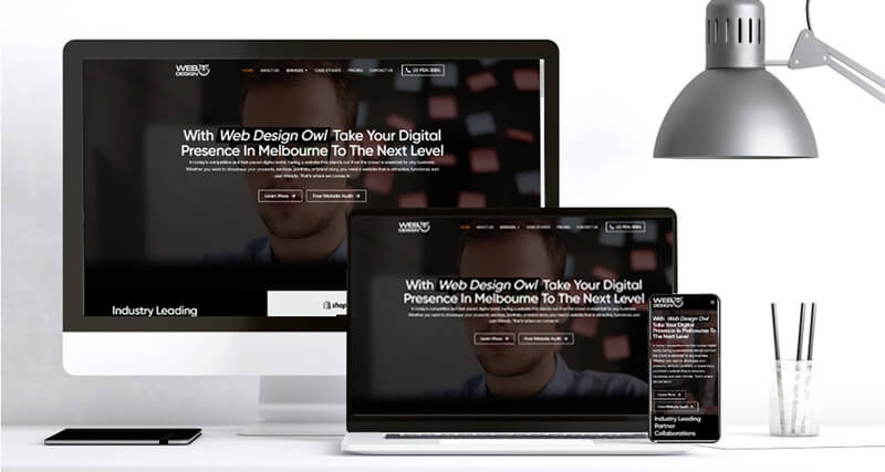
Responsive design refers to a website’s ability to adapt its layout and content to different screen sizes and devices. The core concepts of responsive design include fluid grids, flexible images, and media queries. Fluid grids involve designing layouts that use percentage-based widths rather than fixed sizes, ensuring that elements resize according to the device’s screen. Flexible images scale with the grid, and media queries apply different CSS styles based on device characteristics. Adhering to these principles helps ensure optimal viewing experiences across various devices, from desktops to smartphones.
Choosing the Right WordPress Theme
Selecting a theme that supports responsive design is crucial. When choosing a WordPress theme, consider factors like responsiveness, customisation options, and design aesthetics. Popular WordPress theme frameworks like Bootstrap and Foundation are known for their robust responsive design capabilities. These frameworks offer pre-designed components and styles that adapt seamlessly to different screen sizes, simplifying the process of creating a mobile-friendly site.
Customising Your WordPress Theme for Responsiveness
Even with a responsive theme, customisation is often necessary to achieve the best results. Essential customisation include adjusting the layout to ensure it adapts well to various devices, optimising images to reduce load times, and ensuring that navigation is mobile-friendly. Pay special attention to creating a responsive header and footer, as these elements are crucial for user navigation. Using plugins such as mobile menu plugins and image optimisation plugins can further enhance your site’s responsiveness and performance.

Content Optimisation for Mobile Devices
Content plays a significant role in mobile user experience. Concise, scannable content is easier for mobile users to digest. Strategies for optimising content include using shorter paragraphs, bullet points, and engaging visuals that are resized for mobile devices. Ensure your text, images, and videos are formatted to be easily readable and viewable on smaller screens. Improve mobile-friendly navigation by incorporating clear call-to-actions and intuitive menus that make it easy for users to find what they need.
Testing and Debugging Your Responsive Website
Testing your website’s responsiveness is crucial to ensure it performs well across all devices and screen sizes. Tools such as Google’s Mobile-Friendly Test and BrowserStack can help evaluate how your site displays on various devices. Common responsive issues include elements that do not resize correctly, text that becomes unreadable, and navigation menus that are difficult to use. Regular testing and maintenance are essential to address these issues promptly and keep your website performing optimally.

Conclusion
Responsive WordPress websites offer Melbourne businesses a powerful way to enhance mobile traffic, user experience, and SEO performance. By implementing responsive design principles, choosing the right theme, customising your site, optimising content, and conducting thorough testing, you can ensure that your website meets the needs of today’s mobile users. At Web Design Owl, we specialise in creating responsive WordPress websites that help Melbourne businesses thrive in the digital age. Explore our services to see how we can assist in developing a website that stands out and performs well across all devices.
Let's Find Out Our Success Stories & Social Buzz
frequently asked questions
How do I know if a WordPress theme is responsive?
Check the theme’s description and features for mentions of responsive design. Additionally, preview the theme on different devices or use online tools to test its responsiveness.
How do I ensure my website content is mobile-friendly?
Use concise text, scalable images, and mobile-optimised videos. Ensure that your content is easily readable and navigable on smaller screens by testing it on various devices.
How can I test my website's responsiveness?
Use tools like Google’s Mobile-Friendly Test, BrowserStack, or resize your browser window to see how your site adapts to different screen sizes. Check for issues in layout, readability, and navigation.
What are some common responsive design issues?
Common issues include elements that do not resize properly, text that becomes difficult to read on smaller screens, and navigation menus that are hard to use. Regular testing and adjustments can help address these problems.

